Photoshop Drawings
Community Forums/Graphic Chat/Photoshop Drawings
| ||
| In this thread you can post some of the amazing things you have done in photoshop. This time it isn't a competition, and there are no guidelines or restrictions. Have fun! |
| ||
Just a few of my works over the years. :-)     |
| ||
| the button on the robo limbs doesn't work, you should fix that :) |
| ||
| Sorry, here you go. :-) http://www.youtube.com/watch?v=R0_mLumx-6Y |
| ||
| those are good! |
| ||
Dunno if any of this is considered good, but here's what I've brought about in the last few years:    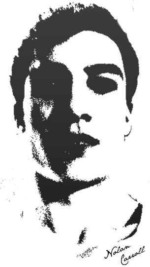 |
| ||
| sweet! |
| ||
1hour of boredom -> this all hand painted in photoshop from scratch Water isn't that good though :\ |
| ||
| Programmer art... :) |
| ||
| Nice landscape.. |
| ||
PaintShop Modeled in "Wings" DOG |
| ||
This is kinda wierd but: I got some B-rated science fiction action figures, and the blockhead guys for gumby, and Voila! I get this. |
| ||
| hahaha! |
| ||
Made with Paintshop Pro 9 Use following link for full res : server.dedicatedservices.org/upload/pictures/paintshoppro/Angel.jpg |
| ||
| Break down the lighting power... |
| ||
| Ouch. Zapped right in the dylithium crystals. |
| ||
| Here are a few other drawings I made with PaintShop Pro 9 I only do this as a hobby, I still have some troubles posing the persons I draw and still improving myself. Wonder what you think of them :-)    Full res versions : server.dedicatedservices.org/upload/pictures/paintshoppro/Bodyarmour.jpg server.dedicatedservices.org/upload/pictures/paintshoppro/DragonAn.jpg server.dedicatedservices.org/upload/pictures/paintshoppro/Melike.jpg |
| ||
 |
| ||
| It reminds me of "A Robot Attacking a City" but looking back on it, doesn't look like any parts were reused. Was there a correlation between the two works or just similar styles? Big fan of your work, love the style. |
| ||
| just similar styles between the two. the strong singular color scheme of each is what does it, plus the overall proportions of the image i think. thanks for the kind words, it keeps me working harder! |
| ||
| @ anime guy: the last image seems to be ok. You should draw every the top part. The rest should be compare with the top part. At least correct both into a single style. @ D_Town_Tony: Instead of use filters, you should draw a nice background. See "i am legend" visuals as sample. I would never play a game wich based on this graphic like yours. I doenst like walk over red floors & burning houses far away of me. |
| ||
Here is the Windows Flag I made. |
| ||
    |
| ||
| Gandalf=liez |
| ||
| Gandalf=liez You what? |
| ||
A character for Shine2Sols: PS7 + Genius MousePen 8x6 |
| ||
| I've seen that picture before, somewhere....? |
| ||
| the face looks like fink or freck or whatever from a scanner darkly but thinner and dressed up more the last one of digital anime's images just blows the other 2 away by a huge margin perhaps its cos its got a photo background (colour reduced mind) and its simpler in composition than the other two but it just works (except for the huge trademark anime eyes) |
| ||
| ? In my portfolio? |
   |