Gems and Jewels - Criticism Welcome
Community Forums/Graphic Chat/Gems and Jewels - Criticism Welcome
| ||
| Here's my thread on gems. And here's my latest one. Taking into consideration all the feedback I've gotten so far. How's this one? (btw, made in Inkscape and tweaked in PSP9)  |
| ||
 |
| ||
| I think your missing the transparent/lucent details another.. 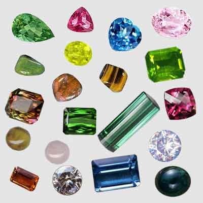 |
| ||
| How's this one? (btw, made in Inkscape and tweaked in PSP9) Not bad, but it looks too *even* to be a believable gem. As you can see in Skully's first picture, those gems have extremely sparkly highlights -- pretty much all of them in there have one or more facets that are pretty much pure white with reflected light, even the full red ones. also, you are using a plain one-color dropshadow which doesn't add to the realism: A gemstone is translucent, and you'd see the gem color itself reflected in the underground as well, with some prismatic effects. In skully's first picture, the red gems have reddish light effects in their dropshadow, the green ones have green, etc.... Of course an even grey background like your drawing isn't the best underground to show off a gemstone, but the even, dark greyish drop shadow makes the colored image on top of it look flat, dull (in the non-sparkly way), and 'wrong' to the eye. Of course, it really depends on what kind of look you're going for in your game: Your gemstone would fit in just fine in a cartoonish environment, but would stand out a lot if you were going for a more realistic environment. |
| ||
| Right...I see your point. I'm going after a not so realistic Bejeweled style but I can see i need to add more defined facets for sure. Yeah going for a slight cartoony style. Hehe right again on the drop shadow. Good call. |
| ||
I made some 3D gems for my game recently. I had all sorts of bother trying to get it to look right, so I decided to find some info on how to do it and came across this, which helped a lot: ...and here's what I got out of it (3D render):  I know you said you're going for a not-so-realistic look, but I found that having a good reference image to hand, made the job a whole lot easier. Often, things don't look anything like the way in which our mind perceives them. That's why my first efforts at gems looked like something that had recently fallen out of the back end of a dog. |
| ||
here is my try on a gem 64*64 and here is another weird one not so good  why use gems when u can use goldbars  |
| ||
| $_$ |
| ||
| Well I hired a female artist to do my gems for me. So we should see the overall quality and polish shoot up a bit. :) She was on the WOW team as an intern...woot! |
   |