poll: which style?
Community Forums/Graphic Chat/poll: which style?
| ||
a.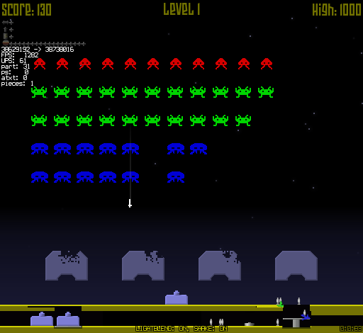 b. 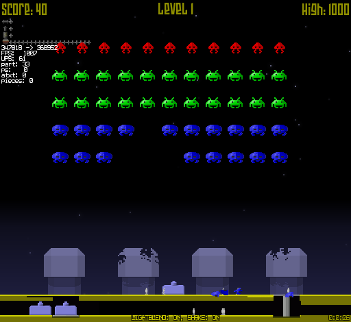 |
| ||
| b JP |
| ||
| b |
| ||
| b :) |
| ||
| A. I don't like the glassy bevel on the blue invaders in b. I like my pixel art pure. |
| ||
| b, but without glossy on the blues |
| ||
| b |
| ||
| A for the same reasons Gabriel stated. |
| ||
| b) - like the red and green invaders, don't like the blue, don't like the 'shield wall thingies' a) - prefer the shield wall thingy |
| ||
| A |
| ||
| I like B.... but what about adding both to your game and give the player the option? ;) |
| ||
| > but what about adding both to your game and give the player the option? Yes, option to switch. Another World Remix has a Classic vs New-look for example so you get the best of both worlds (as it were) |
| ||
| both |
| ||
| thanks for all the comments... I think I'm going to go with B but reduce/remove the gloss of the blue dudes as nobody seems to like that. for various reasons I don't think I'll add an option to switch between the two... thanks again. |
| ||
| A. for me. But with the sockets on the ground like in B. B's enemies look a little like they want to be something the game can't visually live up to. It'll break the style too much. You could make them blocky with a kind of simple shadow like at the sockets of the ground's defence blocks! I like that! |
| ||
| blocky, how do you mean? I wanted to move the 3 core space invaders ships to a look more like other ships I was making... they have a 'little' more depth... but yeah, I'm not satisfied. this game's been in my 'closet' for 2 yrs and I just want to finish it off because I think it's pretty fun. the saucer has slight shading in this early shot 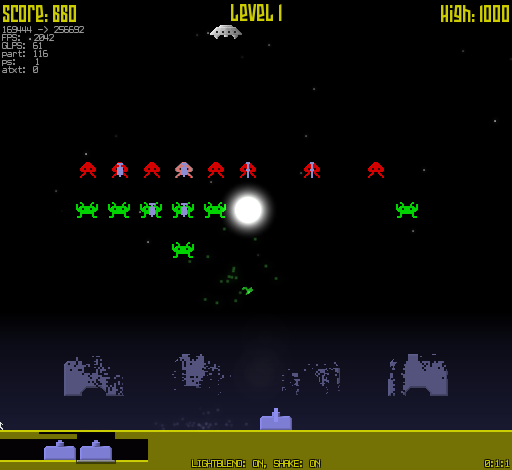 so do these bombers, so I thought the 3 orig invaders were breaking the style a little?  |
   |