classic D20 RPG system, mutated into a PC game
Community Forums/Showcase/classic D20 RPG system, mutated into a PC game
| ||
| https://drive.google.com/file/d/0Bwg1l-y33WTRME5QNTV1YkR1MVE/view?usp=sharing this is a classic D20 RPG system, mutated into a PC game, where you crawl through the dungeon in a turn-based dice roller. its NOT like anything else you've played, it allows you to fit the dungeon together as you go, skills included in the game are; acrobatics,stealth,spellcraft,use magic,heal,combat,swim,Perception,disable traps,survival,handle animals,escape artist,Bluff,and search. its heavily based on tabletop type rpgs. its free for the PC |
| ||
| https://drive.google.com/file/d/0Bwg1l-y33WTRel9NeFV6YmVIQ0U/view?usp=sharing new version, has been tweeked, for deeper exploration, the old version leveled-up to quick, I also have put a cap on combat skill points. Combat is has a higher difficulty Class. I also added a intel MacOSX version. |
| ||
| Some screenshots or an animated gif or a video maybe ? Just to see what you are talking about before downloading, extracting, installing, configuring, etc... |
| ||
| https://drive.google.com/file/d/0Bwg1l-y33WTRdWtWSS1BTTF3QnM/view?usp=sharing I put a screenshot in above link for you. |
| ||
| https://drive.google.com/file/d/0Bwg1l-y33WTRLUpQWVpLdEVYLTA/view?usp=sharing now has is tablet friendly, for the full windows tablets NOT windows RT. works on the microsoft surface , just left clicks. now has 2 sets of useable dice someone suggested looking at this game, its very simular https://boardgamegeek.com/boardgame/3625/deathmaze |
| ||
| the other one to look at is "Dungeon Quest" Heres a link describing it: https://spalanz.com/2014/06/24/dungeonquest/ and some pics: original:  new version:  The interesting mechanic is the blobs on the side they are the amount of moves/cards/time you have before the dragon awakes. if you are still in the dungeon.... Yum, chomp, munch Here in Japanese showing all the cards, etc: 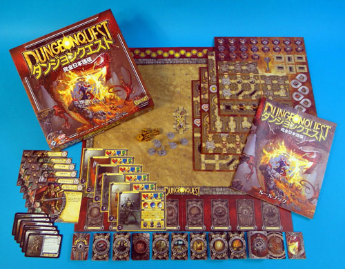 |
| ||
| So, how are these games different from "HeroQuest" ? (roll dices to determine movement, attack, defense, luck...) https://cdn3.trictrac.net/documents/formats/enlargement/documents/originals/d7/65/3c5f91a30dba33977069c545857dbe5f8331.jpeg |
| ||
| HeroQuest is sorta lite d&d with a predefined map and enemies and a quest to complete. you can play solo, but it is better with 1 master and four players. DungeonQuest is totally random (but with a structure) and can be played solo or with up to 4 players. There are a predefined moves/time to get in knick the treasure and get out. you pick a room card and place it next to other room cards on the board, etc, etc both use dice roll for attack, etc DungeonQuest came first Followed by HeroQuest And finally WarhammerQuest There are other derivatives though |
| ||
| @Adam>>Ok, thanks for the infos ! |
| ||
| https://drive.google.com/file/d/0Bwg1l-y33WTRLUpQWVpLdEVYLTA/view?usp=sharing those boardgames are hard to come-by , but my game is free for PC & Mac and has an A.I. |
| ||
| downloaded (thanks for mac version btw :) ) - it opened fullscreen :( - not very friendly. hadn't a clue what to do - graphics serviceable - it's got promise |
| ||
| thx for trying it out adam :) |
| ||
| no problem. my first suggestion would be to tell the user what the goal is |
| ||
| @Mainsworthy>>I have tested but i don't understand how to play, what to do... I suggest to add instructions screens with textes + images... Also you may want to take a look at : HeroQuest (Amiga) : https://www.youtube.com/watch?v=tBr2IYiPWlM&t=03m40s HeroQuest (DOS) : https://www.youtube.com/watch?v=yqQEvdW1XM4&t=03m39s HeroQuest fangame (Windows) : https://www.youtube.com/watch?v=rAdWfNiy9OI&t=30s (i am currently creating a similar game but with a slightly modified gameplay) |
| ||
| @ RemiD 2d, isometric or 3d? |
| ||
| @Adam>>3d isometric ;) (it will be with 3d shapes, but the view will be similar to heroquest on amiga/dos) |
| ||
| so you'l be using the 3d depth culling and not making your own isometric one ? How are you going to deal with the rooms/object collisions? |
| ||
| (we are hijacking Mainsworthy's thread, we will talk about this later in another thread (i am currently creating the map editor, so not much to show for the moment...)) |
| ||
| I'm sorry I'm assuming people know how to play a D20 tabletop RPG, your right I need to add help. thx guys |
| ||
| https://drive.google.com/file/d/0Bwg1l-y33WTRLWxXVkI2OW5vdGs/view?usp=sharing Now has an advanced combat system, dragons and monsters, also points can be spent but not rearranged. I made the game more difficult, and added to the help file updated the Mac version to match most recent version, Adam I added 2 Mac versions for you ones full screen and ones not |
| ||
| source code for blitzMax included in the zip https://drive.google.com/file/d/0Bwg1l-y33WTRLWxXVkI2OW5vdGs/view?usp=sharing |
| ||
| sorta getting better :) Thanks for the source. Can I just say I'm amazed by it? I haven't seen a source like it since my old commodore pet days. Good on you :) |
| ||
| Thanks Adam nice to chat to someone from the old days, I started on zx81 the speccy, then boom every home computer that came out, then DOS then win3.1 , then PCs and game consoles. its been fun I think I still program like a spectrum basic type. |
| ||
| lol. interesting that you haven't upgraded your style from those days. Not even the goto to gosub, then functions (or even logical got names mm21cbb - eek ;) ) Although looking (generally) at the code, it's very compact and in some way simple to see what is going on (i've not looked at what it does, just a glance). moving to more typed/structured programming brings a level of abstraction to things. Speccy was my first (sigh). The hours poured over z80 assembler. fighting with bit masks, etc. My last was a 48k toaster with 2 micro drives (they were brilliant) |
| ||
| I can program in c++ :) I did a couple of chess engines a while back, no goto's but I did use arrays to pass variables rather than pointers hehe. I program as I go without planning, just what works as I need it, the code gets quirky without planning and some things are over-coded, in this game eg: I did twin code for clicking on the two sets of dice, instead of testing which one I clicked, its bad practice, but I can code games very quickly. I'm not a professional programmer but I once got offered a publishing contract on a game, I refused because Id used parts of the code in many of my games, and it was part of the contract I could not use any of the code, I would not of minded but The game I was programing(not the game I was getting published) was like my baby I could not give it up. I did the (z80 LD A,20 DEC 1, RET and flipping a backbuffer) stuff too :) those were the days. I had a comadore 16 and a 64 too. an Amstrad cpc, amiga, he he I wish I still had a speccy, the modern speccy Bluetooth keyboard looked nice on TV but it wasn't a full speccy, and the joypad with built in games wasn't either, don't know why they just didn't re-release a speccy. I never had the drives, but after the many 48ks I ended with a 128k+ tape version. we had radio broadcasts of games you recorded |
| ||
| goto can be useful in some cases and will not necessarily cause spaghetti code, it depends on how you use it... |
| ||
| I once got offered a publishing contract on a game, I refused because Id used parts of the code in many of my games, and it was part of the contract I could not use any of the code Same thing on my side, those who want to forbid programmers to not reuse code (or to recode the same procedure/function) don't understand that there are only a few ways to achieve something optimally... And i bet that many programmers on freelance websites probably reuse older codes (or rewrite them by changing listsnames, variablesnames, functionsnames) from others works that they have done in the past... (even if they say that they don't) |
| ||
| RemiD yep that sounds right, we stand on the shoulders of giants, all the code has been written in part before :) |
| ||
| https://drive.google.com/file/d/0Bwg1l-y33WTRODl2ZWYzdVJSdlU/view?usp=sharing Ive randomised the difficulty class on every skill check, its also harder to pass, making rolling well an important part of the game |
| ||
| @Mainsworthy. Hmmm. I've been looking into the source code, and I think I'm gonna have to take back what I said about it. The source is terrible! I was hoping to go into it and slightly modify, update and generally mess about with it to see what could be done. ;) But.. My conclusion is, it would be better to entirely scrap the code, and use the general concept to build nothing that can be simply understood for others. I began to refactor the code, but it really is a mess to work out what anything does. code is reproduced, large repeated blocks with little difference. variables that mean nothing hhh=1 or rinte anyone? non-existant indenting multiple if's where a select/case would be better I could go on but all that aside. I'm giving you some updated code for the dice display here: hopefully you can see what is being done and how easy it is to write code that is a bit more friendly ;] |
| ||
| @Mainsworthy Pretty amazing you can create anything using code like this :) Without having to change much, do you know about the "include" command? Using this command, you can create a little more structure. E.g. copy/paste all of your globals into globals.bmx - then use include "globals.bmx" copy/paste all of your mouseclicks/GUI stuff into gui.bmx etc. Keep the remaining code (containing your main loop) in main.bmx This will cut down search times and therefore speed up maintenance to your code considerably. One of the things that definitely could use some improvement is the way buttons are done. A quick way I used before moving to classes was something like this (this can also be done with images/hover images of course):
Function Button:Int(txt:String, x:Int, y:Int, width:Int, height:Int)

	Local hover:Int = 0
	If MouseX() >= x And MouseX() <= x + width Then
		If MouseY() >= y And MouseY() <= y + height Then hover = 1
	EndIf

	SetColor 0, 0, 255 'normal color
	If hover Then SetColor 255, 0, 0 'hover color
	DrawRect(x, y, width, height)

	SetColor 255, 255, 255 'text color
	DrawText(txt, x + 3, y + (height / 2))

	If hover And MouseHit(1) Return 1 Else Return 0

End Function

Graphics 1024, 768
Local pressed:Int[5]
While Not KeyDown(KEY_ESCAPE)

	Cls

	For Local i:Int = 0 To 4
		If Button("Press me!", 300, 40 * i + 20, 100, 30) Then pressed[i]:+1
		SetColor 255, 255, 255
		DrawText("Button " + i + " was pressed " + pressed[i] + " times", 10, i * 15)
	Next

	Flip

Wend
Hope this helps! |
| ||
| this is good stuff guys, I will study both snippets. the reason my code is bad , is I just sit down and add on the fly anything that works as I go will do for me usualy. the advantage of my code is what you cant see, it took about 4 days 6hrs a day to complete this entire game, My way of coding takes-out thought and bangs away fast |
| ||
| the advantage of my code is what you cant see, it took about 4 days 6hrs a day to complete this entire game, My way of coding takes-out thought and bangs away fast Whilst I can appreciate the speed, I would have thought that quality (if only to yourself) is also something to achieve. I've been coding about 2 hours and have got the initial basics down. draw the map, handle the current card/tile. etc. Admittedly I have a framework to base it all on to begin with that handles all the events, etc. Here is the base drawing code (i have added the all important const defines too). have a look and see a different approach of display: I'm not sure you would get some of the coding. but in essence each map piece has a number. this is in binary so you can also do binary checking to handle the exits - hence the initial defines AppVirtualWidth, etc is the actual width of my window - this can be anything and is also window size aware - although you would need to add this tracking into the code. the glow adds a glow to the available map positions you can add the current tile. I need to add a few more bits so that it correctly blocks illegal map positions. Here's a quick look so far:  Yo can see the same draw routine for the current card, the map tiles and also the floating (tracking the mouse) current tile. Looking at the draw code you can see that it doesn't need much explanation. all the variables are logical, etc Just a thought ;) |
| ||
| wow Adam! I mean WoW, its a fantastic improvement , I can can see what your trying to show me , I have to admit I never seen that level of programing in blitz before, I have been in the desert help wise, following the list of commands I never experimented to-much |
| ||
| If you have had never seen such code before: check code archives or source codes other users provide. BTW: if x < 11 and players.map[x+1, y] & MAP_LEFT > 0 and players.map[x, y] = MAP_NULL then glow = true end if if y < 11 and players.map[x, y+1] & MAP_DOWN > 0 and players.map[x, y] = MAP_NULL then glow = true end if if x > 0 and players.map[x-1, y] & MAP_RIGHT > 0 and players.map[x, y] = MAP_NULL then glow = true end if if y > 0 and players.map[x, y-1] & MAP_UP > 0 and players.map[x, y] = MAP_NULL then glow = true end if if + if +if ... if + elseif + elseif might get rid of some cpu cycles. Also all 4 if's share conditions if players.map[x, y] = MAP_NULL if x < 11 and players.map[x+1, y] & MAP_LEFT > 0 glow = true elseif y < 11 and players.map[x, y+1] & MAP_DOWN > 0 glow = true elseif x > 0 and players.map[x-1, y] & MAP_RIGHT > 0 glow = true elseif y > 0 and players.map[x, y-1] & MAP_UP > 0 glow = true endif endif Another option is to concat all of them if players.map[x, y] = MAP_NULL and (.. (x < 11 and players.map[x+1, y] & MAP_LEFT > 0) or .. (y < 11 and players.map[x, y+1] & MAP_DOWN > 0) or .. (x > 0 and players.map[x-1, y] & MAP_RIGHT > 0) or .. (y > 0 and players.map[x, y-1] & MAP_UP > 0) ) glow = true endif (instead of "if ... then glow = true" you could write "glow = (...)" - but this also might set to "false" if conditions are not met, which is _not_ the same as above). But even if this might be shorter, I would prefer the first variant. @ Mainsworthy I suggest to listen to Adam ("improving") as this will help for your other games: create some basic "helpers" is one side, creating the knowledge to reuse code is the more important thing: learn to abstract your functionality into functions and reuse them (drawButton(), drawTile()...). @ Dungeon Quest Only owning the boardgame "StarQuest" - a Scifi RPG but imho "lite" and with some prefixed corridors. bye Ron |
| ||
| to reuse code is the more important thing: learn to abstract your functionality into functions and reuse them +1, the more reusable procedures/functions you have made, the quicker you can create another game/tool. |
| ||
| https://drive.google.com/file/d/0Bwg1l-y33WTRWU45SUNmNFdxSzQ/view?usp=sharing here is a screenshot https://drive.google.com/file/d/0Bwg1l-y33WTRSFJUZlk3eFFlcmc/view?usp=sharing I added your dice Adam, and I also changed the display a bit, aswell as added a tile cursor, like you suggested, but not using the methods yet, I also added yoou to the credits Adam, thankyou, its looking lots better |
| ||
| RemiD I do like the idea of reusing code, an OOP and destructors and Libs and includes, but I find I like to just sit and invent I never know what I'm going to do next, but I do know your correct |
| ||
| Nice one ;) ok. I've got the next card, drop on board mechanism operational. I've also got it checking for blocked exits and modifying the results. so... ignoring all the stats, dice, stuff in rooms, etc what I've got is pick a card, put it (correctly) on board playing with it, it feels sort of like dungeonquest. i've made the board 8x8 tiles. lets say I add stairs to the centre it's now a 'torrid tower"? |
| ||
| drop screenshots as you go Adam? you've given me an idea ,an actual game card being drawn for combat or penalty rolls etc.. could be good. |
| ||
| no problem. first is the black screen with the new stairs in the middle. your start position is always somewhere on the edge (the mouse is not over the map):  When the mouse is over the map, the possible locations for the new tile are shown: 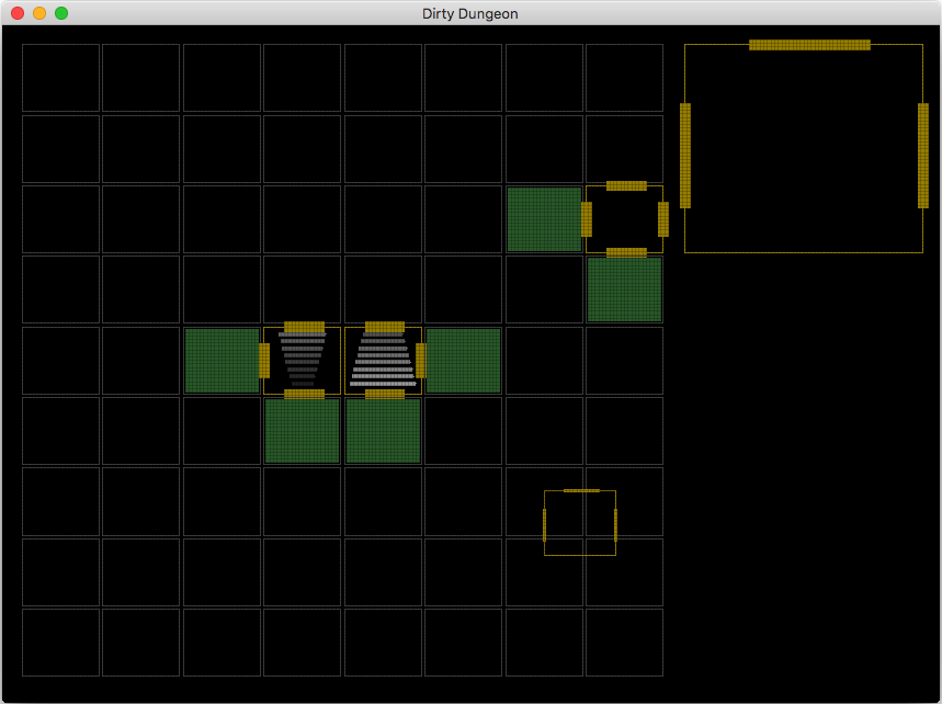 finally with a few tiles placed - notice that some of the exits have been automatically removed (if they were void) 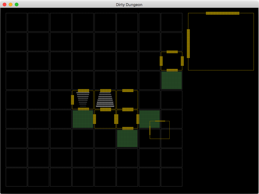 |
| ||
| that's a good idea to show available spots to place a tile, nearly as good as my game :) Not true, yours looks more tidy and well planned . |
| ||
| mmm, just looking at the dungeon quest rules lets add doors - with a door the tile it leads to will either be open (you can place the tile) or remain locked (you can't place the current tile in that location). there could also be a skeleton key or key that could be used to open a door... there's also areas you can reach and areas you can't - i've got my thinking hat on at the moment |
| ||
basic room visited now operational: it works out if you have visited a room. therefore a room that has not been visited (but placed on the map) will not have it's contents shown until you visit it... |
| ||
| https://drive.google.com/file/d/0Bwg1l-y33WTRWWw5R05lYmhWaDQ/view?usp=sharing exits have been automatically removed (if they were void) THANKYOU for this comment makes a big diff in display. |
| ||
| in my game, I'm visiting locations as I place them, it does sound like your way is more interesting to have rooms unvisited yet. |
| ||
| i'm not yet decided on what version to take yet. I'll document as I go and make my findings... :) |
| ||
| It seems that each room has a size of 1x1... why ? where will you put the furnitures, the containers, the traps, the monsters ? |
| ||
| It looks like the details in each room will appear in the big box top-right maybe |
| ||
| currently this is all about the mechanics. it is also using the concept of 1 tile 1 room. until it is worked out exactly what is happening dressing, size is all irrelevant. Mainsworthy quick question for you... What is the goal of your game? |
| ||
| The Goal, is to Level-up(by finding the exit doors) to as far as you can get unlimited - raising the skill level cap every level, then finding skill points to make rolling dice better odds, then collecting as much gold as possible. |
| ||
| ok, next round of updates. there are now 2 players: - You vs computer you place a tile, the computer places a tile current aim to get to the stairs computer aim is to stop you going upstairs so far it is very quick per level |
| ||
| It's stimulating to see you two work on a similar game that i am working on. Keep it up ! |
| ||
| RemiD drop a screenshot? |
| ||
| ok, you've now got a trapdoor that opens and closes. things come out of the trapdoor. you can't go upstairs till all the things are got rid of? |
| ||
| trapdoor sounds like a good step. I added a backdrop of dungeon tiles on unvisited locations |
| ||
@Mainworthy>>I am currently rewriting the map editor so not much to show Here you can see a map, with rooms (in different colors), connected by passages, and some entities in each room. I can create, delete, select/unselect one/several/all entities of a kind and set their properties (orientation, position, other...) The current structure of the world is : ;Map ; Rooms ; FloorWallCeilings ; EntryExits (to enter in the map or exit the map and go to another map) ; Statics (columns, furnitures, containers, machines, plants, rocks) ; Items (clothes, armors, shields, weapons, projectiles, spells, treasures, artefacts, bandages, splints, potions, creams) ; Traps ; OLightSources ; OLights ; Passages (Visible, Concealed) ; TurningMovings ; Characters ; Projectiles ; MagickProjectiles I can create a map with rooms and entities in each room very fast (but it is not finished). Then i have a function to autodetermine the model of each floorwallceiling depending on its position in the room and if there are others floorwallceilings around it or not and if there is a passage on it on or not. My goal is to create a game which is a mix between HeroQuest (DOS), VagrantStory (PS1), Diablo2 (Windows) |
| ||
| looks good in that camera angle, I would say it looks interesting and well programed. |
| ||
| Creating maps/environments has always been a major obstacle in all my past projects, so this time i decided to start with the map editor to be able to build maps fast... |
| ||
| I have to leave you guys for a week or so, my girlfriend has just imformed me were going to stay with her parent this week, so I will catch-up with you guys soon. |
| ||
| my girlfriend has just imformed me were going to stay with her parent this week Sorry to read that. Hope you are able to ride that out :-). I hope Adam keeps the code "cross platform"-compatible (no mac-xlusive thing). If some assets are needed, maybe they could be done in collaboration too (first of all a pre-rendered d20-dice - or a 3D one - is a must, think in terms of "board game immersion"). bye Ron |
| ||
here's the latest pic green blob is you, red are things have come out of the trapdoor dark green tiles are what you have placed and have visited grey tiles are what the computer has placed and/or have not been visited |
| ||
ok, here's the above code, but with the line graphics removed and bitmap graphics: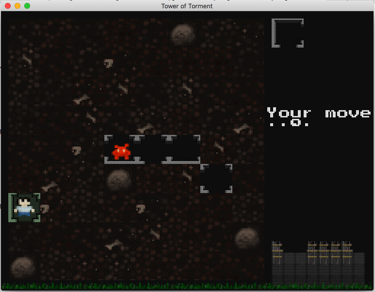 the grass and the thing on the bottom right is your tower (being built) The trapdoor and stair graphics are not finished. And i'm still working on the mechanics. but it is improving slowly :) |
| ||
| @AdamS>>It seems that you like to jump from one project to another ahahah :P (i do the same but i try to limit this bad habit) Focus ! Focus ! Focus ! (where is our friend the wizard ? You had a good start with the graphics style, the environments, the characters, and you could adapt all these in a dungeon...) |
| ||
| and you could adapt all these in a dungeon that was the plan, but I hit an internal engine problem, so it has currently been shelved. |
| ||
Since we are talking about designing a dungeon/maze, here is how not to do it :QuestOfTheSpiritBladeblockedpassagebug.png) It seems that there are random falling rocks which can fall (!!!) and block any cell of the map, the problem is when you are almost at the end of the quest and random falling rocks block a passage of the path to the exit stairs ! Wanted behavior or bug ? No idea but it is frustrating for the player (me in this case) Anyway ! |
| ||
| no, the rocks don't fall. they are permanent blocked tiles |
| ||
| Some are blocked from the start, some are blocked while in game (after you pass on the cell), apparently randomly, and in this example this blocked my path and i was not able to go back to the exit to finish the quest... Anyway good game, a little too limited, but i like it. |
| ||
here's the next revision: - the tower on the right is now 13 floors high and has gained a tree and front door - the mini monsters on the bottom advance towards the tower and enter the tower when they get to the front door. - there are different characters to pick from, but not yet operational. they will each have slightly different abilities |
| ||
| ok. I had some issues with the timing system - this was the ..o. which moved and triggered other stuff moving. I couldn't work out the best method of display which simplified things and also made sense. I've now got this sorted with a new mechanism for the computer move as well:  -basically the crow flies to the right and grabs a tile - when it has a piece if flies back. the board flashes where you can drop a tile - when you drop a tile the crow turns around and goes togged another piece - if the crow reaches the board with the tile, the computer places it and the tile drops |
| ||
| Another option is a candle burning down, a sand clock, ... But the crow is indeed a nice idea to keep it "immersed" (within its theme/topic). A pity that the main character is so low-sized, surely "items" (clothes, weapons) are hard to distinguish once equipped (dunno if this is possible in the game). looking at the screenshot in #69: Is there a reason for the "right sided wall" to be one pixel less wide than the left side? Perspectively you are viewing it from top, so both sides _could_ be the same. Hmm maybe 2 pixel-sized-walls looked a bit too "lite"? bye Ron |
| ||
| good point about the wall size :) |
| ||
| wall size now changed and different floor levels being worked on. here is level 0 - the garden  |
| ||
| Let me suggest another graphical improvement (imho): I assume that the tiles with the figure in it are supposed to be "lowered" compared to the outside tiles. So may I suggest to have a bit of "bricks" on the sides with the walls? or some kind of "brighter grass/earth/..." ? Just as it hardly covers the wall below ? Maybe that would improve the look (especially for surrounded blocks like in tile 6,2 of your screen - the enclosed rock) This (- removing the "cut"-look of the walls when there is nothing on the other side of the wall) would allow to return to a 3pixel-wide wall and using that slight "offset pov" (maybe 80� instead of 90�) for additional dimensional looks: slight shadows. Nonetheless: a 4px wall allows for more details (slightly darker parts to form patterns) BTW: is the tree handmade? looks nicely lighted/illuminated. BTW2: when you widened the wall, you did also shrink the "inners" of the tiles - the circle (3,1; 6,1; 8,1) are now not centered any more (center-portion of the circle is 3x in horizontal compared to 2px in vertical). bye Ron |
| ||
| the tiles are actually above the 'grass' not below. but interesting thought circle has already been corrected. tree hand done 20x36pixels |
| ||
| If they are _above_ the grass, they should have visible outsides - as for now it looks like digged into the ground-rooms (similar to dungeon keeper). But of course it makes more sense that it is build on the grass (see right side of the screenshot - the tower). If the outside tiles are not "that overly" used, showing the outside walls there should be unproblematic. The outside could be visually different to the inners (because of world-lighting versus in-room-torch-lighting) bye Ron |
| ||
| For those who care, here is what i have done today : rd-stuff.fr/HQSM-autocreatenodes-autocreatelinks-FBLR.png a procedure/function to autocreate nodes in rooms and a procedure/function to autocreate links between nodes of the same room and nodes of passages. Next steps : create the procedures/functions to autoupdate the "accessiblestate" of nodes/links which are near and intersect with a static obstacle (containers, furnitures, machines, plants, rocks, entryexits, olightsources) or a turningmoving obstacle (characters) so that depending on if some nodes/links havespace/areobstructed they are considered/notconsidered for the pathcalculation. And then create the procedures/functions to calculate a nodespath and to follow a nodespath... |
| ||
| so its a multi-link linked list, or type array? |
| ||
| This nodes+links system is a little special because it needs to be able to update what i call the "accessiblestate" (=if a node/link isintersected/isnotintersected by a static obstacle or by a turningmoving obstacle) in real time. This system use one list to store the properties of the nodes and one list to store the properties of the links and one 2 dimensions list to store the properties of the cells of the grid. Each cell of the grid corresponds to one grid coordinate, each node is associated to one cell (with its index), each link is associated to one node (with its index) (4links max or 8links max per node), and so if i want to update the "accessiblestate" of the nodes/links near a turningmoving obstacle or a created/destroyed obstacle, since i know the position of the obstacle and its width/depth, i can determine which cells are concerned and i can use the cells array to get the concerned nodes indexes and then i can get the associated links indexes (without having to browse the whole lists, that's the supertrick), and then i can calculate their new "accessiblestate" depending on if the nodes/links donotintersect/intersect with the obstacle (so that they will/willnot be considered for the next pathcalculation). This is fast. (but only works for grid based nodes (there can be links at front, at back, at left, at right, at frontleft, at frontright, at backleft, at backright)) see : rd-stuff.fr/HQSM-autocreatenodes-autocreatelinks-FBLRFLFRBLBR.png (but for the moment i only use links at front, at back, at left, at right, like Hero Quest) |
| ||
| I'm not sure if i understood all that - it sound uber complex have you thought of a base type with left/right/up/down create your array form the top left working left, down, new line. you should now have a single array being addressed array[x + (y*width)] you can then simply fill in the left/right/up/down fields in each 'cell' with either a true/false or the actual array position (either is good, but the second more useful) so now you can see if any cell has valid exits and the cells they link to You can simply extend or add more data for each cell :) |
| ||
| It is not complex, i am sure that you would understand, but maybe i don't explain it the best way. I prefer to keep it this way (with nodes and links which are represented by low details shapes), because then i will probably reuse the same procedures/functions but this time with nodes positioned around obstacles and around passages (=not on a grid), like i did here : rd-stuff.fr/autocreate-nodes-then-autocreate-links-640x480-10fps-HQ.gif |
| ||
| @RemiD try putting a http://www. at the beginning of your image link to make it embed :) @Derron The outside walls. what a great idea. it will be too simple to add... NOT LOL But I persevered and here is the result:  it results in the pieces being more jig-saw like, which is good ;] |
| ||
| @AdamS>>I know, i write it this way intentionally, to not flood the thread, so that only those who want to take a look, do it... |
| ||
| Some progress : rd-stuff.fr/HQSM-autocalculate-nodes-accessiblestates-links-accessiblestates.png the procedures/functions to autoupdate the "accessiblestate" of nodes/links which are near and intersect with a static obstacle or with a turningmoving obstacle so that depending on if some nodes/links are accessible/inaccessible they are considered/notconsidered for the pathcalculation. in green : the nodes and links which are accessible (no obstacle intersect with them, a path is possible), in red : the nodes and links which are inaccessible (some obstacles intersect with them, a path is impossible) |
| ||
| I love this stuff. Thank you guys for sharing. Jason |
| ||
| @outside walls Yes you have to check for neighbour tiles with "border walls" so this adds another overlay for all of these next-to-a-wall-tiles :-) BUT: now it looks like a tower without a roof ("top down look-inside view") If you get low on space for your pixels on a tile (aka "more space to draw on") you might shrink the wall now again - by the previously added pixel. Also: often outer walls are bigger than the ones inside, so this could shape off 2 pixels on the inner walls ... but hmm maybe it makes the whole thing "flutter"/twitchy (with rooms having 3 outside walls - like in [3,5] ). Aside of this: think it really improves with each screenshot now. bye Ron |
| ||
| yep the top-down look is intentional (yep i know the players are face on) ok, looked at the walls and made the interior ones 2 pixels narrower:  also added visible floors to those you've visited + gold outline. |
| ||
| @Adam>>What is the usefulness of the small graphics at the bottom ? Just for the style ? |
| ||
| they actually serve a purpose: on the right is the tower/keep you are building. it will grow as you go up a level (build a floor) the bottom shows the grass and any approaching monsters. when the monster reaches the door (to the keep) it goes in and comes out of the trapdoor |
| ||
| Just a tiny mention here... Finally got this little number to compile and run without problems on windows!!! |
| ||
| @last screen: 1,1 : misses the outside wall on the top right 1,3 / 3,5 / 3,6 / 4,6 : trees are overlapping the walls. This looks nice, but it wont work for towers bigger than 2 floors. The less-wide walls do not look as twitchy as feared ... if you go d'accord with it, everything is fine. Also the ground decoration benefits from 2pixels more in each direction. @ top down I think nobody would blame you to draw only the heroes hair and shoulders - or the red head of the monsters. The current pov to the units is fine. bye Ron |
| ||
ok, couple of things. first is tower shadows: second is to do with moving up higher floors. Any previously placed tile will now have a roof:  |
| ||
| teeny-tiny update: display has been recoded giving better shadows and more animation. plus the right mini view has new been improved with buttresses and roofs: 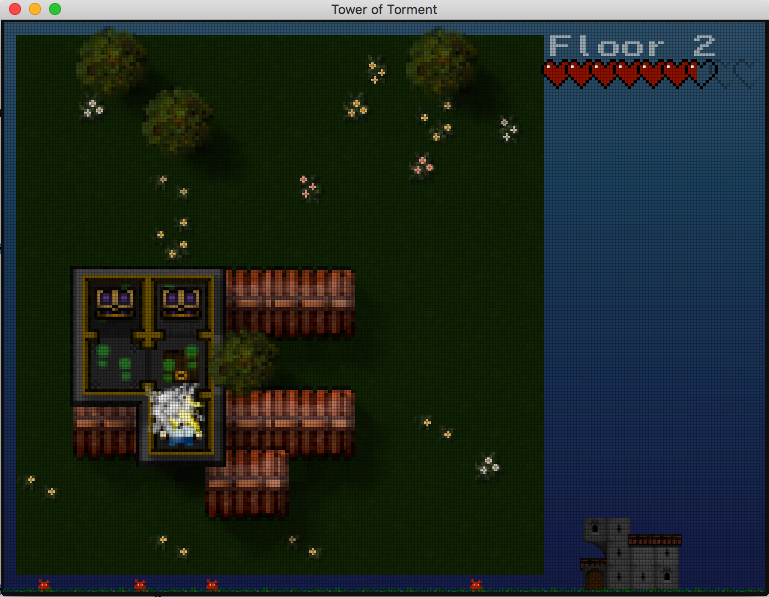 |
| ||
| Great (visual) improvements.. Maybe think of adding special sprites for connected tiles (roofs next to each other). Do not forget to darken tiles of lower floors..to emulate "depth". This might improve the look of a "tall tower". Like the look of the chest sprite ...nice choice of purple (king's color) Hope it gets finished and not aborted because of some hurdles to climb. Bye Ron |
| ||
| @Derron it's starting to come together in a way that other projects haven't (everything looks right and is challenging) today got the correct mechanism for picking tiles and where they drop. the bird actually flies to the correct place and drops them on the board. implemented luck. luck is how often a wildcard tile (tile that can be placed anywhere and open up previously closed areas). so different characters can have different luck. Luck could also be found in a chest? "You feel lucky?" currently in testing I am also getting brilliant "Shouting at screen" moments where a tile blocks you, etc. Yay :) |
| ||
| I find funny (and reassuring) that around the same theme/categoryofgame, it is possible to create many different gameplays and graphicsstyles (my game is also about D&D theme/categoryofgame but the gameplay and graphicsstyle will be totally different than your game or than Mainsworthy's game !) "Opportunity is not monopolized" :) |
| ||
| lol. yup! ok. i've now got a theme and a quest: rescue the villager kept hostage in the high tower: 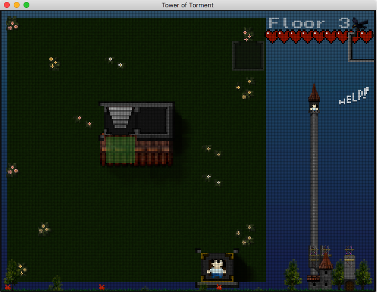 you can see the keep on the right is now much more graphically finished I'm going to really start work on the people graphics, etc and how they all interact i've written a tiny subset particle system. it has pre-programmed movement, alpha fades, etc. so it is very simple to set up: StormAdd(235, xpos,floorlevel-5, 1000, STORMMOVE_NONE, STORMFX_FADEALPHAIN) StormSetDirection(rand(-30, 0), rand(20,40) ) sets the particle sprite to #235, life is 1000 (1 second), it fades in from 0 to full alpha the direction is angle, length |
| ||
| StromAdd() ... you should not need to Add Strom (Power/Energy in German) ...albeit dungeons and fairy tales remind to Brothers Grimm and their (collected) tales. Ok, the villager should be a princess then but I doubt that there are enough pixels for long hair so you end up with a villager wearing something pink :-) (I think you are able to create a little princess...) Looks really improved compared to the first screens. Think adding some torches (with slight "light overlays") will be something you enjoy too (maybe with custom particles for some sparkles). @Interface vs playground Maybe you could add some drop shadow so the interface is "over" the playground (pov similar to "populous). bye Ron |
| ||
| storm corrected.... I think you are able to create a little princess I'm way ahead of you there. watch villager you rescue, you can use next time. so it's a sort of pokemon/collect mechanic. so you might be saving a princess, or a boy or a zombie - possibly. |
| ||
| sorta starting on the rest of the game system now. death with intro screens, etc. here is a (static) shot of the main menu and name:  the actual menu text will go in the faded greyed out area in the middle. There is also music and sound and lots of animation with the little guys being chased around by a spooky ghost, before getting a different set of chattering guys... and... One last thing: Mondo Keep Mondo Keep Build Defend Kill Repeat |
| ||
| Just a little nitpicking: "M" in Mondo: left hand is "anti-aliased" making the "|"-part looking thinner than the right hand side. "N" in Mondo: same, but this time right hand is thinner. Also the "pixel-grid" seems to be off a bit (visible as the M's right-hand-"|" has a "0.5-width"pixel-row). Maybe this is also the reason for this "darkened" pixel row in the center of the image (between the "KE|EP". It is not really darkened, but the pixel-grid-overlay is offset resulting in a very narrow "pixel"-row. @KEEP this more looks like a game about a "not sooo bad/young and cute" dragon (or reptile). Is there a reason for this bright green (the green/yellowish color is indeed nice, but imho does not "express" the right thing). -> would like to have a similar thing for my TVTower-Game (always liked "overlayed" letters... just did not find the right "setup" for my game). @4th person What is Han Solo doing in the game? :-) @1st person might wear a long spear @missing person No druid/mage or archer? @tower It ... it misses a door. @BG fits to the pixel look. Nothing to blame here ..except the darkened rectangle seems to move up on the right side (because of the diagonal lines). ... again, this is just a little bit nitpicking, nothing serious: nice work and improvements. bye Ron |
| ||
| yup, nitpicking as usual ;) i hadn't noticed the differences in the mondo text - corrected, the background actually moves too, so don't worry about it - lol I'm just doing a sprite separation so you can create your own characters... |
| ||
| @create own characters Do you mean "choosing weapon, clothes" or are you talking about replacing the images (which is OK for me too). @nitpicking It is done on a high level ... and I am doing this because I like the development steps presented here (am not doing this if I do not like what I see / feel about a game). So do not feel attacked or so. And say it _kindly_ if I should stop nagging you with these little unneccessary things. Ok, so I allowed myself to emphasize what I meant when talking about the problematic overlayed-grid: 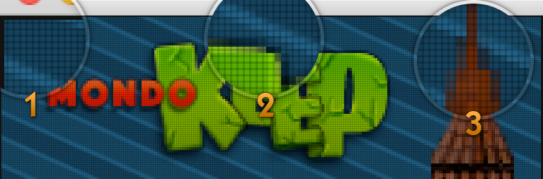 Spot #1 The grid seems to start "halfed" - is there a reason for it? Spot #2 The grid-cell-width in the center is halfed, might be based on the spot #1-offset Spot #3 Because of the offset, "pixels" bleed into other cells. Next to the offset there seems to be discrepancies between "cell dimensions" and "pixels". Take the left side: it starts in the middle of a cell but ends right with the next cell (on the right of it). I would assume that it either starts halfed and ends halfed - or starts full and ends full (1 or 2 "pixels" - just wrongly offset). Expressed in pixels: bottom emphasized roof portion is 26 px wide. cell size is 3 px (1px border + 2 px inner). 26 px / 3 px = oh oh. Now it looks as if the towers roof is not scaled according to the "grid". Left to right is 2 (real) pixels less wide than needed. Scale should be "3.0", maybe BlitzMax does some rounding down ? Maybe offsetting the grid correctly, creates a "sharper" look. But as asked already, there might be a reason for the offset (special visual effect or so). @Moving BG To be able to believe you, you should offer some test downloads for us spectators :-) Preferable for Linux. If you do not intend to "sell" the whole thing, you might even think of publically developing the game (via github). Dunno what you plan with it, so I have to hope for "FOSS". bye Ron |
| ||
| @Derron>>Personally i appreciate your feedback, as long at it is not arbitrary (not a matter of taste), it can be useful to see what others with a different experience, notice or not. However maybe focus on the really major flaws/inconsistencies (that the user may notice), not the tiny details (that the user will most likely not notice). |
| ||
| @AdamStrange>>Your title screen looks just consistent enough to me ^^ (except maybe the top of the tower and the tree which look a little blurred compared to the others things, but nothing important) |
| ||
| @tiny details If I see them, others will surely notice them too (they have better eyes than me ... wearing glasses for ages now ;-)). @Matter of taste This is also a ...hmm difficult subject. I wrote about that "green text" which looks a bit bright. Of course this is a matter of taste and I did not mention it to say "change this and that", it was mentioned to express what I thought when looking at the image. So it is a mix of "bug" finding and personal feedback. Maybe things look really different when seeing them in "action" (like the diagonal stripes thing... surely looks better when moving). @blurred look This might change if they fit into the raster of the grid. But the tree looked to me a bit "less sharp" too and it is a bit contrary to the "sharp/crisp" look of the units. But I also understand that this might be wanted, as leafs let light shine through (transluence) while the armory of a knight wont do that. So for me the tree is ok though. @major flaws without playing the game we can only review the GFX or presented ideas (like the crow placing tiles - which is a good idea - at least in theory and while "playing the game in my mind"). bye Ron |
| ||
| ok, the actual resolution is 256x192 which is the spectrum pixel resolution But it is not a static resolution, as sprites can be scaled up down at native resolution. sounds odd but works not too bad and wasn't planned either. the overlay grid is at native resolution and is overplayed. because the resolution is independent (can be anything) there will always be some weird offset problems as the grid is displayed - (it is not pixel but double based, hence the jumping and scaling) - But as it is completely resolution independent, the game will always look right (if stretched) on really strange window settings. so you can just resize the window or run fullscreen. no issues. it all 'just works' the scaling artefacts on the title screen are because the sprites are being scaled up from their native 1x pixel to 2.6x. I'm just using the single texture tales for everything, so all the graphics are being re-used and scaled up (currently). on creating characters: - There are 32 different monsters, although I can reuse, rescale and recolour for more if needed. - There are 64 individual characters to pick from. But.... the new character design is based on parts (head, top, bottom, shoes, hair, extras, hat, holding). each part can be colored, and there are lots of bits for each part type. E.G. there are 40 different top types! So to deign a character, you pick each part and a color it. so there should be thousands of possible characters to pick from... the graphics themselves are tiny: - main graphics = 140k - title graphics = 12k - font = 2k sound is different. running at 1.1mb so far all 16bit uncompressed wav |
| ||
| @resolution independence Did you try to limit playingarea (plus minimal interface) to multiples of the base resolution. the missing pixels to the native window resolution could be displaying the interface background. That way it should stay "pixelated/crisp" without getting blurry. Hope I explained it in an understandable way. @characters Nice thing. @filesizes thanks to lowres. Sound might get smaller too...with mod/xm instead of mp3/ogg then. The small blipa and blops should all compress to 7-10kb (mono 64kbit). Bye Ron |
| ||
| resolution is crisp at any resolution, never blurry. 100*1009 640x480 1200x500 there is a base res, but it is not fixed when resizing. You would get very strange playing areas if you use odd resolutions though... hehehe main game sound not started. Just working on the intro, title stuff atm. Will probably use a custom sequencer for music, but not yet fixed... |
| ||
| Hmm, maybe I did not explain well then. Let's assume you target your resolution of 256x192. The user now uses a window size of 800x600. The biggest possible "integer"-scale is 3. So you might scale up to 768x576. There is some kind of padding / inner margin now: 32px horizontally and 24xp vertically. The whole game is centered within 16,12 - 784,588 now. The surroundings are filled with some stretchable parts of the "interface". Every GFX is scaled by "3.0", which makes them stay crisp. As there is no "ratio"-adjustment, playing area will be the same regardless of the resolution. Only difference between resolutions is the amount of "stretched interface". It is similar to adding black bars on differing aspect ratios ("letterbox"). Conclusion: It is similar to "VirtualResolution" with the exception of padding everything so it scales to integer values only (1, 2, 3, ... instead of 1.2, 1.5 ...) Hope it is now explained in an understandable way. I fully understand, that this might need manual refining of sprites, eg. you want the "Tower" on the title-screen to be that size, but the size is not available when scaling "without fractions". So you might end up eg. scaling to an integer-part and manually increasing tower height by using a middle part 2 times more. bye Ron |
| ||
| Being able to customize the player appearance and equipment is very good imo, i plan to do the same. It can extend the game replayability by inciting the player to find new equipment/specialitems... |
| ||
| @Derron. yep, fully understand what you mean. I don't need that as my graphics remain crisp at ANY resolution without blurring, etc. The only reason the tower is blurred is because I have deliberately scaled it up - so it will look blurred. I may actually do some proper pixel graphics for it later :) |
| ||
| double post |
| ||
| It cannot look "crisp" with the grid being offset (at least I understood the "grid" as if you look at bigger pixels - with pixels bleeding out of the grid cells, it looks "blurry" - even if colors do not fade and are full opaque). So I somehow think you assumed to understand what I tried to express, but I still failed. Nonetheless, continue doing your development and do let you disturb by things which could get adjusted later too. Edit: created a little sample to show what I mean: At 800x600  At 800x480 (old smartphone):  bye Ron |
| ||
| It cannot look "crisp" with the grid being offset (at least I understood the "grid" as if you look at bigger pixels - with pixels bleeding out of the grid cells, it looks "blurry" - even if colors do not fade and are full opaque). So I somehow think you assumed to understand what I tried to express, but I still failed. Nonetheless, continue doing your development and do let you disturb by things which could get adjusted later too. Edit: created a little sample to show what I mean: At 800x600  At 800x480 (old smartphone): bye Ron |
| ||
| I hear you... Don't tell the panda though. He keeps telling me there is proper crisp graphics at ANY resolution. Here's a quick shot (not scaled) of a different sized window:  I've tried medicating the bamboo, but it looks like crisp graphics to me + a nice graphics aberration (that stray line) here's another shot without the grid: 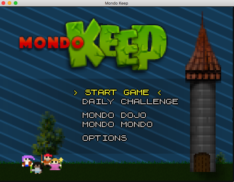 |
| ||
| snakey-ghost :-) @proper crisp graphics: - compare my code (and the screens) and yours In your "stretched screenshot" you will see, that the sprites are bleeding through the grid cells. This is not happening in my code. Eg. the "M" in Mondo ends "half inbetween two grid-cells". BUT ... yours is doing "fullscreen", while mine has either black borders, or needs a tiled interface/overlay. Keeping it "integer"-scaled does not allow for fullscreen (except you adjust the view-to-the-map of a player) Again: the screen without the grid-overlay does not expose the problem, everything looks nice. The "grid" is the one not playing nice. And as you scale to "non integer", it might bleed at some cells (rounding errors). As said, do not feel disturbed, just want to help perfecting the game ;-) bye Ron |
| ||
| Nope. There is no bleeding in any cell Unless the sprite is being shown at a resolution other than it's original 1x1 Such as the trees and tower - these are not 1x1 but something like 1.6x1.6 - so they will bleed (sub pixels). But there is still no bleeding in any cell for 1x1 the ghost is also being scaled before you let me know ;) I'll put an option to turn off the pixel grid |
| ||
| ...argh, BRLs custom forum does not allow quick-edit. Sorry for double post. |
| ||
| Ahhh ... now I got what you wanted to me to explain: Not all objects are drawn at the scale of the "grid-overlay". So it is not a matter of miscalculation but arbritary/individual scaling. I was under the assumption that everything fits into the 256*192 pixels and is just scaled up (same scale factor for everything - or the next "doublicated value" so magnified-pixels of sprite A are having the same dimensions as of sprite B - or are 2x, 3x, ...) Got it now :-) (sometimes translating English->Brain fails) (so that means the "logo" wasn't designed for the used resolution and therefor is scaled to "fit into the scene"). (the narrow "grid-row" in the middle of the screen still is a valid bug then) bye Ron |
| ||
small update. the options screen: i created a very quick Gui system to support any additional stuff I might need to add. very small code :) |
| ||
| Maybe add another button below the "Left, Right" ... "quick config" or so. When activated, it asks for all inputs one after another. This way gamepads could get setup'd quicker ("left right up down fire"). Alternatively just traverse through all options automatically once the first one was clicked. @mouse cursor (minor thing) maybe the third stripe (of the glove) should be already a bit oriented to the right side of the glove. BTW: if you use a "mouse driven" way to open the options, you should provide a "mouse driven" way to close it (eg. "OK"-/"Cancel"-Buttons). Or are you reacting to "right clicks"? bye Ron |
| ||
| Alternatively just traverse through all options automatically once the first one was clicked. Brilliant idea!!!!!!!! |
| ||
| just a tiny update here. It compiled on windows. and.... The sound worked as well with no problems! So I can now give both windows and mac downloads (note 3d won't compile) |
| ||
| So I can now give both windows and mac downloads good, i will test when it is ready. :) |
| ||
| I just deleted it off my online drive, it will probably still be available for a short time, so if you want it - get it now https://drive.google.com/file/d/0Bwg1l-y33WTRWU45SUNmNFdxSzQ/view?usp=sharing here is a screenshot https://drive.google.com/file/d/0Bwg1l-y33WTRSFJUZlk3eFFlcmc/view?usp=sharing Ive learned a lot reading adams updates with pics and you guys adding your insight too |
| ||
| Welcome back. The project is your baby :) |
| ||
| ok, I think I'll wrap this one up now as it all slowly went Pete Tong! So what has been learned: - lots - got a windows compile so that is great - don't mix styles, either artistically (the way it looks) or game play - the right 2d tower didn't really match the left top down display - moving to faux 3d didn't help, it just complicated everything - pixel graphics are hard, until you find a good presentation in your mind - pure top-down looks crap. clear, but crap - faux 2d (sorta top down but showing walls looks great but you need clear vision to begin with, otherwise it gets too complex - internally there was a map[x, y] with heaps of checking. a better solution is to have your map 2 units bigger, with the min and max units never used (they will always be null or MAP_NONE). this means your map now starts at 1,1 and you can remove all bounds checking. so you can legally have x-1 and x+1 without checking x is in bounds :) simple but sneaky - blitzmax uses virtual resolutions, but you can scale output of sprites to be bigger to smaller than the virtual resolution. so nothing lost, lots learned. NEXT! |
| ||
| don't mix styles, [...] game play may work in some cases imo. pure top-down looks crap. clear, but crap hotline miami looks good imo... pixel graphics are hard, until you find a good presentation in your mind I agree, 2d seems easier in theory, but in practice, once you have to create 8 views of each pose and several poses per animation, and the possibility to equip/unequip different faces, hairs, clothes, armors, shields, weapons, magick, not sure that 2d is easier in such case. |
| ||
| so nothing lost, lots learned. NEXT! think your biggest learning project is: finish projects ;-) A lot of effort has been put into it, just make it a finished game, even if it is a bit crap or does not have over-the-top gameplay. There are plenty of things you could learn while continuing the project (missions, creature AI, sound management, Linux/Windows deployment) bye Ron |
| ||
| agreed about finishing. but - I tried to do something new with the visual style and it just doesn't work |
| ||
| Now ignore the visual style and just learn the rest while finishing the game. visual appearance could be adjusted in the final stage - if really needed. bye Ron |
   |